Video is a powerful tool to increase awareness of what we do and who we are. However, as with all communication material, it needs to follow the principles laid out in the Brand Manual. Please refer and use this visual set up for all movies. It is important to ensure we are consistent in our narrative and messages, especially when it comes to sustainability, so we do not speak with conflicting voices in different parts of the organization. Remember, a strong brand is built when you deliver on a promise. Please follow these rules when creating films and videos:
- All films regarding greener branding or sustainability are produced centrally. If such a video is to be produced locally, prior approval must be obtained by contacting Group Brand and Marketing.
- All videos produced need to follow the templates developed for video production in terms of texting and layout of video.
- Films approved should and will be added to the Hydro’s YouTube channels.
- If we already have a video for the topic, this video should be used and if needed translated to the local language.
Grid/Watermark
A grid (or frame) should be established to avoid any elements being placed too close to the edge. The grid should never be visible.
Watermark should be placed in upper right corner and be visible throughout the whole film.
Exception:
Watermark should not be part of the end page, where the logo (tagline version) appears bigger and in full color.

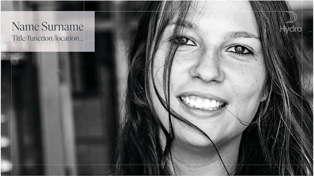
Personal/General information
Personal or general information (for example, name of person being interviewed) should be placed in upper left corner.
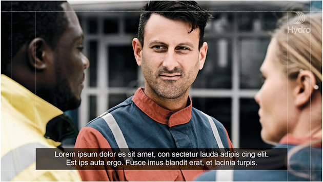
Subtitles
Subtitles should be centered and have a darker background. Note that films are widely seen on mobile devices today, and size of text needs to reflect this.
Try also to minimize amount of text that is shown. Rather more frequent changes than too much at once. Never more than two lines.
Titles/Chapter text. Transparent background
Titles or chapter information should be placed either on a transparent background or a solid color. Example shows a dark, transparent color version.

Titles/Chapter text. Transparent background
Titles or chapter information should be placed either on a transparent background or a solid color. Example shows a white transparent version.

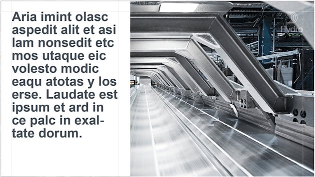
Narrative text. Solid background
Text as narrative should be placed either on a transparent background or a solid color. Example shows a white, solid background.
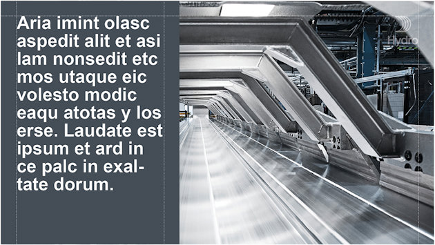
Narrative text. Solid background
Text as narrative should be placed either on a transparent background or a solid color. Example shows a dark, solid background.
Narrative text. With smaller, transparent box
Narrative text boxes can be placed where most appropriate on the film, but should always be locked to the edge,as shown below.

Narrative text. With smaller, transparent box. Examples
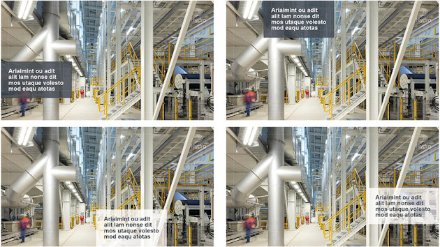
Narrative - text only
When narrative text is placed directly on the film without a background box, always make sure legibility is as good as possible. Avoid long texts and avoid using this feature if the film is very detailed or with huge contrasts. Addi- tionally, make sure text is not placed inappropriately, for example, on a person’s face or similar.

Transitions
Transitions between sequences (or ‘chapters’) should be done consistently throughout the whole film.

Important:
To make sure the style of the film is according to Hydro’s overall tone of voice and visual identity, avoid creative or ‘funny’ effects.
End of film
The end of the film should always carry an ‘end page’ with Hydro’s logo, as shown below. This should not have the watermark.
Updated: 11 July 2024