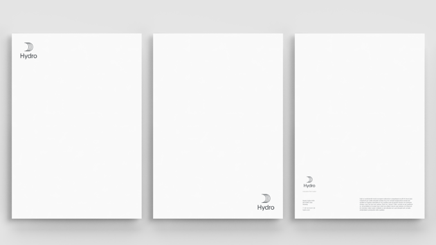
The top left and bottom right corners are the preferred positions, however, you may also place the logo in the top right or bottom left corners depending on what works best in the specific context.

You may place the logo on top of images or solid colors as long as there is sufficient contrast between our logo and the background.
Preferred placement – top left
Top left placement is recommended when the logo has an introductory role, for example on our website, stationery, or on the front cover of a brochure.
Preferred placement – bottom right
Bottom right placement is recommended when the content (text, images, illustrations and other graphics) is primary and the logo has a signature role, such as in advertisements.
Other placement options
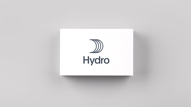
A horizontally and vertically centered placement is allowed when the logo is the only element on the surface. Examples of this are on the back side of business cards and in video end frames.

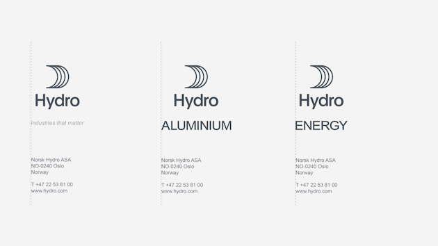
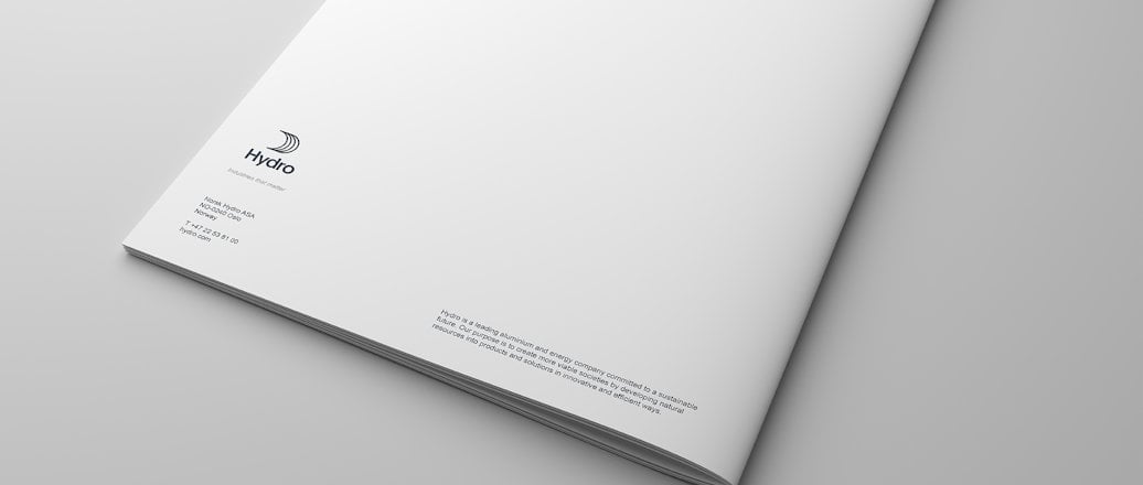
On the back covers of brochures and similar printed matter, the logo is always positioned above our contact information in the bottom left corner. This is implemented in all relevant template files.
Correct alignement is shown in illustration below.

Updated: May 15, 2024
