


We have defined our colors with specific values for both print and screen. Always make sure you adhere to these specifications for all applications.
Primary palette
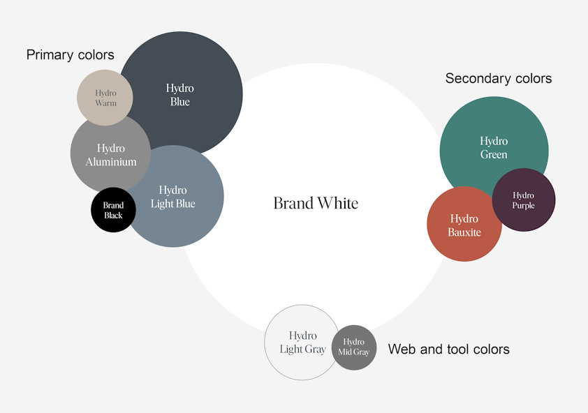
The primary palette consists of five colors, including black and white. Hydro Blue is our main color. It is used in the logo, and extensively throughout the visual identity, carrying the strongest brand recognition.
|
Hydro Blue |
Hydro Light Blue |
Hydro Aluminium |
|
Print Screen Paint & textile |
Print Screen Paint & textile |
Print Screen Paint & textile |
|
Brand Black |
Brand White |
|
|
Print Screen Paint |
Print Screen Paint & textile |
|
Secondary palette
The secondary palette has been developed to complement our primary colors. It provides versatility in situations where many colors are needed, e.g., to create complex graphs and charts.
|
Hydro Green |
Hydro Warm |
Hydro Purple |
|
Print Screen |
Print Screen |
Print Screen |
|
Hydro Bauxite |
|
|
|
Print Screen |
Web specific colors
In order to comply with accessibility requirements and for greater flexibility, two tints - one darker and one lighter - of our Aluminium color are available to use on our website.
The dark tint must be used whenever text needs to appear in gray.
The light tint is for subtly separating a certain area from the white background, like in a fact box.
|
Mid Gray |
Light Gray |
|
|
Screen |
Screen |
Color balance
When designing, you should always think of how to use the different colors in our palette. Below you can see an illustration showing the proportional use of primary colors, secondary colors and the tool colors in Hydro materials.
It is important to use the Brand White color and white space in the design to add personality and a touch of class.
Updated: February 19, 2026